Blue Food Printer Test Page
If you have been part of the edible printing community for a while, you have likely heard about the Weekly Test Print I created for edible paper printers. After months of testing, I have created one for Blue Food Printers by Icing Images!
Let’s take a look at the Test Print and what it can show you. This resource is available for free, and you can download it below.
Quick Glance
When your Blue Food Printer is tuned and adjusted correctly, this is how the Test Print should appear.
Information
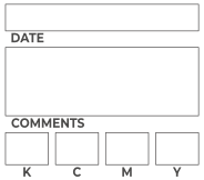
A space has been provided to write in the date, comments (e.g., product printed on, specific job you are working on, etc.), and the saturation level for each color.
CMYK Wheel
This shows you the Primary Colors (Cyan, Magenta, Yellow) and Secondary Colors (Green, Blue, Red) of the Subtractive Color space used in edible printing. You can learn more about Subtractive Color and how it affects edible printing here.
The Color Wheel can also help with testing for color bleeding when two or more intense colors print side-by-side.
Color Swatches
A selection of colors with shades going from full intensity to a very light intensity. In addition to checking for color accuracy, the Color Swatches test how intense colors bleed into less intense colors.
To aid with calibrating your saturation levels, the numbers to the right of each swatch show you which inks are combined to produce the color. Here is an example:
Your Red appears too orange. Looking at the numbers, you can see that Red is created by mixing Magenta and Yellow in equal parts. To reduce the orange appearance of your Red, you can try reducing the Yellow saturation by a few points.
Printhead Alignment
This area is for checking the printhead alignment for Blue Food Printers with two printheads. If the printheads are out of alignment, you will see a ghosting to one side or the other.
For all Blue Food Printers, you can use this to test the distance between the bottom of the printhead and the product being printed on. The lines should be sharp. If they are not sharp, then the printhead is too far from the food product.
Text Sharpness and Bleeding
The text should appear sharp and there should be no bleeding between the letters and the color blocks.
Monk Skin Tone Scale
Many Blue Owners love that they can print photos of people on their food products. The Monk Skin Tone Scale is a sample of colors that are typical for the skin tone of many ethnic skin tones.
Perception of Color
When it comes to edible printing, there is only one important question, “does it look good?” The answer is a bit more complicated because each of us perceive (or see) color differently. This sample image includes a wide variety of bright and dark colors for common fruits. This sample image should “look normal and look good” to you when your Blue Food Printer is properly calibrated.
Download the Test Print
Download the Test Print using this button. Check back occasionally to see if the Test Print has been updated. I am always testing new inks and techniques, and learning more about edible printing. As my knowledge grows, I sometimes make changes to the Test Print so you can benefit too.
How to Use
Simply print the image! The Test Print will only use half of a letter sized sheet of paper.


